
Thursday 11 December 2008
Are you Rendering...???
Wednesday 10 December 2008
Fly Through Shots...Birds Eye
I chose to start this shot from a birds-eye point of view because i like how as the camera streams down towards the kitchen window, the fan blade just cuts past the lens for that split second & is about to reposition for the next shot. Next we establish the the set of windows opening simultaneously, whist the cam. zooms out focus on more objects that are laid around. The closing shot however also ends with animated windows, but this time shuts horizontally.
Tuesday 9 December 2008
2nd StoryBoard:- Larry the CockRoach VS. The Kitchen
 The second re-run of the storyboard, was more clearly layout & structured than the first. The first attempt was very rough. Alot of ideas were still being brain storm but not yet put on to paper. Some individuals wanted specific shots & some disagreed to how it wouldn't just fit in.
I re-drew & layout the storyboard yet again, taking in everyone's input in ideas and just incorporated it on the design.
Most of the shots shown here are kept much more simple, so it's easyer on the auidience's eyes. Also we didn't want the camera to move so extravagantly to a point where it's machine gun with so many unwanted key frames.
Monday 8 December 2008
the grain is back..!!!
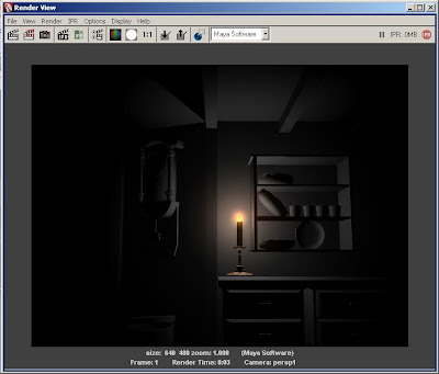
 test rendered with 3-point lighting, but this time with all the walls & ceiling included in the background scene. However it's given us that unwanted grainy / picsulated result yet again....
But more tests to come, update in progress....
I finally get a chance to test render animation on the bird & kitchen furniture moving. Alot of experimenting played a big part in this session, i wanted to animate with our exsisting light we are currently using to see how well it would capture shadow & tone when objects are moving.
In this scene, i quickly animated the lower cupboard doors, opening from left to right in the style of a cannon ( mexican wave).
Whislt doors are opening the ceiling fan is contiually spinning at a consistent speed through the whole of the animation. The windows however slowly expand as if a gush of wind blew into scene. Also including the wall clock, animated & timed exactly the length and duration of the animation sequence. Which finally ends with a shadow of a bird reflected from above.
I just wanted to include a quick play blast clip of a successful animated ceiling fan. Achieved simply by centering the pivot point at the centre of the mechanism joint & just animate the Z axis through rotation. Followed by duplicating the first set of key frames & adding it after the first set on the timeline.
Thursday 4 December 2008
Commands & Scripting for MaYa
"EXPRESSION"
bend1.curvature = noise(time)*0.5;
Texture It Up...!!!!!

Variety of screen shots:-Mid,Birds-eye,establising,long etc.
I took screen shots of the newly textured kitchen, still however included with our sunlight "lighting". I added alot of primary colours purposly keeping it plain & simple, abit like how T&J scenes are textured. A more of a old,outdated style kicking in.
I personally feel that without this style of lighting included, the colour without stand out as much & wouldn't show the colours/theme taken from T&J. So we do dedicate the whole scene to lighting, it really has enhanced many features in the project..just hope the audience would agree when they come to watching it...
Hang Them Up..!!!

From the pots & pans i previously modeled, i moved them into position of the hooks & hunged it up in a casual stance. For the extra pans, i just duplicated a couple more, but this time re-sizing it & excluding the sides. Just to keep the kitchen alot more fuller & vary in the different shapes & sizes.
What's the TIME.....???

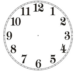

Here's the fully updated, wall clock re-modified from Dean's original clock. The first design was very old with outdated features such as pendulums, mahogany wood effect etc, that just didn't fit into our Tom & Jerry theme. So i got rid of the extra outer features & maintain it to a classic round shape.
The model was simply achieved by creating a cylinder polygon & just extruding the inner face of the shape to create the clock face. The number face was just an JPEG image taken from the web, and imported as a lambert.
I kept the clock hands separate so that it could be easyily animated, causing less fuss & problems later on.
Wednesday 3 December 2008
It's a MuGG Rack..!!!


The mugrack/panrack was model using yet again the rovolve tool under surfaces and curves.
I began with the hook fixtures, outlining simple curves to the design & duplicating several to even out on the board.
The back board was modeled with a polygon cube and flatten in a shape of a 2x4 . After that stage i combined all the pieces to one, & imported it through the exsisting file.
The colours were very easyily addressed using simple texture colours taken from the program & mixed it using ramp shader.
The image(above) was to give an idea of how the rack would look in scene, and a couple of muggs
hung & moved into position just to compliment the finished result.
POST-IT...Here..!!!
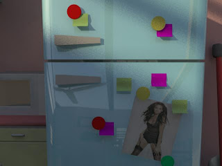 I'll keep the notes on modeling post-it very brief, as it was ever so easy to do. All it took was to create a polygon plane, selected the faces from a corner & slightly curved it, to achieve that natural paper image.
Tuesday 2 December 2008


Monday 1 December 2008
Cleaning Up That HyperShade...!!!!


As the title states, I did clean & neaten up the hyper shade, deleting any unused lambert or unnesscessary shadings that isn't consistently used.
The aim in doing this is to organise the files, which makes finding layers and lamberts so much more easyer. Also reducing the file size results in opening the file ever so quick and effcient.
Thursday 27 November 2008
The Kitchen...It's Coming More To Life.
 So as the title clearly say's, the kitchen really is coming to shape. As we keep filling up with more & more kitchen equipment, it seems more alive and a sense of realism to the scene now. However we keep referring back secondary resource,continuously asking the question "what can you usually find in a kitchen??" so we look in our own kitchen for some ideas & inpiration, to see what can be modeled & incorporated in the scene.
On our team blog we each allocated objectives of what we must model. I took full charge of modelling FRUIT BOWL,MENUS,BOOKS
DOG/CAT FOOD BOWL,PHOTOS-OF THE 3A
POTS, MORE DISHES. The results so far have been great, we want to keep cross referencing with the Tom&Jerry colours, so that we can keep the theme consistent. But right now the fruit bowl needs modeling & more touch up's on the texturing...so its to be continued.

The test render image isn't as clear as i hoped, but it was meant to show the dog food & bowl. D's was originally modeling crumbs, but however the end result came to looking more like dog food. So i just duplicated several of the pieces & just randomley laid it in the bowl also with some trails lefted on the floor. For a more casual, messy look. I mean let's face it, whos kitchen is ever tat clean!!!!??????

More texture added, i didn't texture the floor with a "blinn" but with a lambert instead, because i don't want the final outcome with such a shiny,reflective mood..which will just be to much to the audiences eye.
The greeny/turqouise blue was yet again referred from Tom&Jerry...personally i think it really works, its becoming more of a softer cartoon environment.

The textured pots & pans i previously modeled...I feel it needs to be re-work, both pots look abit to "white". Needs more of the mettalic/metal appeal.!!!!
Wednesday 26 November 2008
Just 4 Funnnn..!!!! =P


The ideal "Teenage BOYs" kitchen.hey!!!!
Let's Model More...I Mean Why Not????

 Another upgraded design to D's pots & pans. Gave it a more modern shape, relating the design to everyday kitchenware we use today..But this time i gave the pot a lid which also can be use for the pan... The surface & revolve tool has been very good to me, Its helped in making models look so much more appealing, to the eye which in the end hopfully compliments the scene.

 An updated design of the wine glass, re-modeled from D's original design. I just gave it a more narrow, sleek design, abit on the posh side....i must say!!! & yes there is a hole in the glass now, we're back to more realistic...


Monday 24 November 2008


Saturday 22 November 2008
Cheers Mr Rob L.Jones!!!!
 It was amazing, animation was just stunning to watch, which also complimented with a simple storyline about love and rivalry between two men & one lady.
 We did finally learn about rendering in layers & how faster, easier & efficient it will by for us in reaching our deadlines. It was very interesting, its always nice to learn & take new things in especially if it helps us for the better in the future..
.jpg)
http://uk.youtube.com/watch?v=FXET1kvEOAY
Wednesday 19 November 2008
More Lighting&Texturing Research....
-Colours in the pictures are taken as reference. Hopfully to be incorporated the kitchen.


He kicked off with a little brief of what he's familiar in doing & to get some sort of idea of what all our project environment is based on.
What he showed 3A was a way of experimenting with our camera shots, using a technique called "bookmarking". It was definitely something new i learnt which made camera shot playing so much more easier.
Also through looking at the new changes made in the kitchen, Dean was able to clean up any unwanted polygons with a few changes to the objects. Which as a result will make working so much more smooth and efficient.
Tuesday 18 November 2008


Monday 17 November 2008
The Light Of My Life..!!!!

More light-Testing with those candles... thats all, going to keep it short..
Friday 14 November 2008
The Light Of My Life..!!!!

Yet again are a couple more updated screen shots of the sort of lighting i was using in todays event, ranging from all sorts of different tones and colours. But still experimentating & hav not settled with a final tone...to be continued.
Wednesday 12 November 2008
The Light Of My Life..!!!!
 Today the modeling & LIGHTING continues, i just began looking at some candleStick's online as reference and to get some sense of idea's in designing one of these things. Modeling the candleStick, was done using the surface/revolving technique, which i personally found so much more easyer & can i say alot more comfortable, complimented with alot of less-stress.
The completed look of the candlestick is the image posted on the left & another with an added candle & wick on top.
Modeling this was good practice, your able to go alittle nuts with the design just as long as the shape has more curves than 3-point polygons.
I continued to play around with the design, working from the top-to-bottom using the scaling & extrude tool, until i was happy with a completed shape structure.
The candle however, was ever so simple to model. It was just a simple cylinder polygon extruded. Secondly i scaled down the top face, followed by extruding the face up to create the wick...Very easy!!!i must say.....

A screen shot of the modeled candlestick accompanied with the candle & wick...!!!!
 (Above)
Half the day gone, came to finally playing/experimenting with some textures & some fun lighting...
I started with the flame, however it was painted on photoshop,mixing 'fire' colours with the blurr or smudge tool.
After that had been done, the file was just saved as tga & attachs to maya through 'lambert,new material', and WHAA-LA..a flame on maya.
Finally i just used the colour palette from the software with some fill effects to bring the wick alive. The candleStick holder was from a lambert colour taken from a marble effect mixed with two tones of brown-ish/yellow.
Lastly i attachs an ambient increasing the glow to the flame to expand the lighting & just kept on test-rending with mental-ray to see the current result until lefted with printed screen shots that i was satisfied with...
But overall i am please how it turned out. By just adding increasing the ambient glow & adjusting the shadows really adds to the appeal of the candle and stick.

Here's the finished results...
More to come
see you then, stay tune....