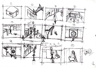
 The second re-run of the storyboard, was more clearly layout & structured than the first. The first attempt was very rough. Alot of ideas were still being brain storm but not yet put on to paper. Some individuals wanted specific shots & some disagreed to how it wouldn't just fit in.
I re-drew & layout the storyboard yet again, taking in everyone's input in ideas and just incorporated it on the design.
Most of the shots shown here are kept much more simple, so it's easyer on the auidience's eyes. Also we didn't want the camera to move so extravagantly to a point where it's machine gun with so many unwanted key frames.

No comments:
Post a Comment