
 So as the title clearly say's, the kitchen really is coming to shape. As we keep filling up with more & more kitchen equipment, it seems more alive and a sense of realism to the scene now. However we keep referring back secondary resource,continuously asking the question "what can you usually find in a kitchen??" so we look in our own kitchen for some ideas & inpiration, to see what can be modeled & incorporated in the scene.
On our team blog we each allocated objectives of what we must model. I took full charge of modelling FRUIT BOWL,MENUS,BOOKS
DOG/CAT FOOD BOWL,PHOTOS-OF THE 3A
POTS, MORE DISHES. The results so far have been great, we want to keep cross referencing with the Tom&Jerry colours, so that we can keep the theme consistent. But right now the fruit bowl needs modeling & more touch up's on the texturing...so its to be continued.

The test render image isn't as clear as i hoped, but it was meant to show the dog food & bowl. D's was originally modeling crumbs, but however the end result came to looking more like dog food. So i just duplicated several of the pieces & just randomley laid it in the bowl also with some trails lefted on the floor. For a more casual, messy look. I mean let's face it, whos kitchen is ever tat clean!!!!??????

More texture added, i didn't texture the floor with a "blinn" but with a lambert instead, because i don't want the final outcome with such a shiny,reflective mood..which will just be to much to the audiences eye.
The greeny/turqouise blue was yet again referred from Tom&Jerry...personally i think it really works, its becoming more of a softer cartoon environment.

The textured pots & pans i previously modeled...I feel it needs to be re-work, both pots look abit to "white". Needs more of the mettalic/metal appeal.!!!!


 Another upgraded design to D's pots & pans. Gave it a more modern shape, relating the design to everyday kitchenware we use today..But this time i gave the pot a lid which also can be use for the pan... The surface & revolve tool has been very good to me, Its helped in making models look so much more appealing, to the eye which in the end hopfully compliments the scene.

 An updated design of the wine glass, re-modeled from D's original design. I just gave it a more narrow, sleek design, abit on the posh side....i must say!!! & yes there is a hole in the glass now, we're back to more realistic...


 It was amazing, animation was just stunning to watch, which also complimented with a simple storyline about love and rivalry between two men & one lady.
 We did finally learn about rendering in layers & how faster, easier & efficient it will by for us in reaching our deadlines. It was very interesting, its always nice to learn & take new things in especially if it helps us for the better in the future..
.jpg)


 (Above)

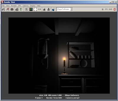
 I think the time has come to really start focusing on 'lighting'. I do hope the group agrees & is behind me on this area in the project.


